Maps are one of the bedrock tools in the wayfinding kit. They’re important for orienting users to the space they’re in, and an important first step in being able to appreciate and understand a place. Without the ability to create some sort of mental model of a place, no matter how rudimentary, it becomes harder to see it as more than an unconnected collection of destinations or points of interest. It’s easier for some people to formulate these mental map conceptions than others, but I do think it’s possible on some level for anybody to do it enough to enhance their experience of a place. There are a few things that wayfinding designers can do to make this easier for more people, more of the time.
Orientation
Geographers have conditioned us to expect maps to be presented “north up”, that’s the convention. It’s probably even a useful convention when maps are abstracted to an atlas or similar context. It becomes very problematic though, when we place maps in a public space, in three dimensions, and then stick slavishly to north up because it’s “correct”. North up might be be right in a given situation, but so might east up or southwest up, depending on the context. Maps should always be shown in the same orientation as the space — if the map is presented vertically, users expect that what is at the top of the map is what is in front of them, left is left and right is right. There are few things in life more confusing than a north up map when you’re facing south. The best of all, but more rarely seen, is a public map oriented horizontally. In that case the orientation absolutely needs to correspond with the space. I have nothing to back this up, but I’d wager that a properly oriented horizontal map is more fully understood by more people than any other.
Simplification
It’s usually not too helpful in a wayfinding context to show all the details of a place. Too much information becomes as bad as too little, making it difficult to understand what’s important and what’s not. I worked on an interesting mapping project recently, redesigning the public map for the Rideau Canal Skateway, the world’s largest skating rink. The facility has traditionally used a geographically accurate representation, presented “north up”. The canal, and the Skateway, are often perceived by users as roughly linear, but the geographical truth is far more complex. But the bigger truth is, it doesn’t matter what the accurate geography is. What does matter is the location of service clusters (rest areas, washrooms, etc.), common destinations, and finding your way back to where you started. When we let go of geography and started simplifying down to the essentials, the map started to look a lot more like a linear path, and looked a lot more useful for visitors, especially first-timers.
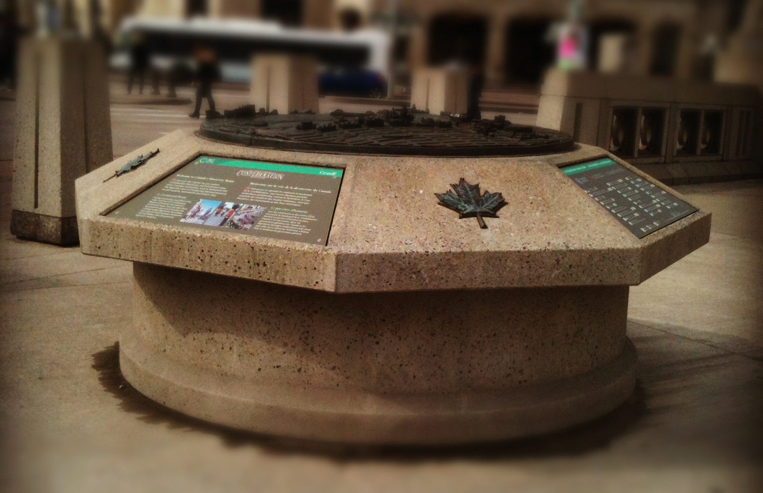
Group-Friendly
There’s an interesting thing that happens when you put a group of tourists in front of a map. They start talking. Discussions begin around what they’ve seen and what they ought to see. Differing interpretations of the information on the map emerge. More discussion. Strangers talk to each other, and make recommendations. It’s a highly social experience. In my observation, the larger the physical size of the map, the more social the experience can, and often does become. These conversations can be invaluable in solidifying a mental conception of the place, aiding the creation of a memorable experience. Designers can help all these good things along by creating legible maps of a good scale, and siting them in ways that aid in making sense of the surroundings and place them in a context that is enough removed from pedestrian traffic flows that lingering is encouraged.
What’s Next
So far all I’ve talked about is physical maps, located in physical space. But that ignores a pretty big elephant in the room — GPS maps. I’m a frequent user of GPS mapping on my iPhone, as many people are. For everyday finding my way around, it’s amazingly convenient. I can’t help but notice though, that standard GPS maps, the kind you get straight from Google, violate most of the points listed above for wayfinding map best practices. While you can rotate the map by rotating the phone, the correct orientation for the direction you’re facing remains a bit of a mystery. The maps themselves show as much detail as they can, rightly so, given their general purpose nature, but it’s often more than is best for wayfinding purposes. Group-friendly? GPS maps on smartphones are very much a personal thing — they don’t lend themselves well to social wayfinding.
A better GPS answer is site-specific mapping tailored to the purpose. An impressive example, perhaps the gold standard in this area, is the myNav Central Park app from Winfield & Co. I’m not going to say more about it — if site specific GPS mapping interests you, you need to get a copy and try it out. It’s impressive, even if you’re not actually in NYC’s Central Park. Of course, not every site has the visitation or the budget to be able to justify or afford a custom GPS solution. Where GPS doesn’t make sense, keeping in mind these few best practices for wayfinding maps should help get any project off on the right foot.
____________________________________________________
Like this? You might want to check out other posts from the Wayfinding category.
Follow me on Twitter (@intudes) for interesting links and occasional observations.
Subscribe to the RSS feed, and don’t miss another post.
Pingback: Maps | Luma de Oliveira